 I chose this image because I found the geometric shapes very interesting. The complexity of this piece comes from the geometric simplicity, and sometimes being able to create something that is simple yet aesthetically complex is sometimes harder than creating a piece of art that looks very complex. I am not sure what the artist wanted to say with this piece but maybe she wanted to make a comment on the need for more simplicity in a world that is full of capitalist greed trying to sell you unnecessary stuff.
Andrea Zittel
I didn’t really understand or like much of her work. I picked this piece because it made me think about when people go camping, and instead of connecting to nature they stay in metal boxes. Also the mat that looks like grass in interesting. I’ve definitely seen people at the beach put a mat down on top of sand or grass. 
Andrea Zittel

I found this work to be dynamic because of the juxtaposition of the scene and the room it’s in. I love that the ceiling looks like a warehouse which is very rigid and structural, but the walls look like country home wallpaper. Then this white landscape left me almost confused because there is no real element of life to it for me. It looks both bland and separated from nature while also emulating a snowy scene that hasn’t been touched by people. It captured extremes for me that I think we have spoken about a lot throughout this course where what is displayed in the artwork contradicts its meaning/effect on the natural world. The bare, rustic feel to it around the edges really creates a play of hard and soft that I enjoy. It almost feels like a setup they would have in a camping store where there could be a shoe display or something on the fake terrain that signifies the opposite of nature when you think about it. A lot of her work made me think of camping store fake scenes set up and I actually liked it but couldn’t place why exactly. Probably the same reason I love plastic fake food. It’s just interesting to duplicate natural existing things in fake man-made materials, because really why?
Andrea Zittel

Something I read about Andrea Zittel was that for part of her experimental designs for living she made six “uniforms” and wore them everyday for six months. I really love this idea. There is no reason people need 20 shirts/pairs of pants/shoes etc. I love how part of her design is to live minimally. She is asking, ‘what do we really need?’ I also like the design of the dresses she made. They look like they are made of very natural materials, and would make me feel closer to nature wearing them. If this was a fashion line and also affordable, I would probably buy one.
Planar Pavilion, 2014

I didn’t feel myself connecting to much of Andrea’s work, however I found the paradox of her sharp edges and the organic shapes of nature to be interesting. This piece in particular stood out to me, mostly because it seemed to be the one exception to the paradox; the industrial coldness in a sense perfectly matches the coldness of the environment. This whole piece shivers. Even the bright red of the metal somehow goes along with the stark and frigid atmosphere.
Andrea Zittel

I really want to like Andrea Zittel’s work. But in all honesty, her sculptural office spaces and living spaces that are installed in natural surroundings feel very cubicle-ish to me. I don’t like that. It doesn’t feel like the right structure for the landscapes she is immersed in. But then again, maybe that is the point. And me liking it or not is really not what matters. It is the message. Perhaps, we are living in a cubicle world circumposed in our natural surroundings.
These structures also remind me of the whole little house movement. I love the idea of living in a tiny little house that I can easily move around to new surroundings. The structures are also very cool and modern. They represent contemporary society quite well, but there is an element of simplicity to it. Maybe that represents a need for simplicity in life and letting go of materialism? I am not sure if that is the point of her work. They are certainly functional structures, which I like. But, again, kinda cubicle-ish.
A-Z Management and Maintenance Unit; Model 003 – 1992
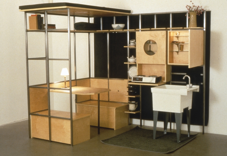
I like the living spaces she designed and built. They are minimalist but still looks good. Most people our age are in apartments or dorms at this point in their life. Maximizing space and utility but still keeping it nice is a problem we all deal with. I like these particularly because its a fusion of productivity and creativity. A lot of art that we come into contact with are useful only in their appearance. These works are functional as well and involved multiple design and construction elements. It also just reminds me of my own living situation. Last year I was in a ’76 Holiday Rambler which I traded up for a ’07 Dutchman (both RV’s). The rambler was considerably smaller but it reminds me of this picture. You could lay in bed, wash your hands in the sink, and reach the kitchen stove all in one go.
Andrea Zittel

Lay Of My Land, 2011
I chose this piece because it was one of the few amongst several works of hers focusing on fabrics and patterns that actually involved the environment, and I enjoy this one as an artistic representation of the land. I enjoy the aesthetic of a solid color (especially black or white) being used to make a solid landscape or a background on which to form the heart of a piece. I like this piece in particular for its wide representational expanse of land, it’s detail of rockslides and little houses, and its resemblance to stop-motion claymation films. It has what my mind classifies as “a dollhouse twilight zone” feel, and I love it. It’s cute, visually interesting, and eerie at the same time.
Andrea Zittel

FLAT FIELD WORKS 2 & 3
Ok so I chose this photo because it’s pretty much one of her only works that actually “interacts” with the land. I don’t really like her work I feel like she’s not an artist but rather an architect. That’s not to say architects aren’t artists but I feel like she isn’t really. Like okay her house/bungalow/structures are super futuristic squares and domes I don’t find them to be anything special. I just feel a little pissed off looking at her stuff (??) I don’t know. I don’t see it as art. I see it as a potentially super pretentious person standing a piece of metal in a field and being praised for it. Like you just ruined a perfectly good field. I don’t see how she really interacts with the land besides building stuff on it. I’m getting way too worked up over this but I just don’t see it as art.
Richard Long

This piece reminds me of the dirt drawings we did in class. I like that it looks like it was done with his hands. It seems like maybe he had the edges of the rectangle taped to give the straight edge appearance. As much as I like certain aspects of this piece, however, I don’t think it really comes through in photograph and kind of just looks like wallpaper. I wish the piece was not so uniform. I love the idea of dirt as a material, but I think the subject matter still needs to be interesting. This piece, like a lot of the pieces I looked at by Long sits somewhere between art and just showcasing nature for me. I know art means a lot of different things to different people, and we can define it many ways, but it is sort of frustrating to see something so simple and accept it as art.
